Art & Design
This will be a online journal/portfolio to post my work, get feedback, and share in the fantastic world of Art and Design. I am open to critique, and excited to see where things go.
Wednesday, May 8, 2013
Box Package
Thursday, April 11, 2013
VNEA Pro Smartphone App
I recently finished a project working on a smartphone app. for playing VNEA billiards league. I didn't do any back-end coding, but I did use Axure to create a prototype to conduct testing with. Once I knew the page-map and layout I wanted, I designed an interactive pdf that gives a mock representation of what the app would be. You can check out my workbook for the whole project at: https://docs.google.com/file/d/0B-5lO0EoFGX2ZmtscUhfUkdFN2s/edit?usp=sharing. If you download the file, the second page should have the working interactive file. Let me know what you think. Thanks.
Monday, February 25, 2013
Logo Bootcamp
This was a: create four logos in two weeks project. We came in, were
given one word or concept. With that word a word map would be created
for ~10 minutes, before sketching. Sketches were 1 every minute for 30
minutes. At this point the top direction or two would be selected and
refined through tight sketches until ready to be scanned in and worked
digitally. Here are three:

Intelligence was
the word that sparked this logo. I took the idea of being a
philosophical thinker, and rethinking concepts, having ideas inside of
ideas, etc.
The concept was
Salt and Pepper, a Mom-and-Pop type restaurant. I struggled to find
interesting form, or to have lost and found shapes with the negative and
positive. I didn't find a great logo solution in those explorations,
and took it this direction instead.
Bird was the only
word that we got on this day. I thought a lot about feathers, and wanted
to find a way to either use the feather silhouette to be a bird, or to
make the bird become the feather. In my explorations I came across the
bird flying out of a feather and breaking free. I plan to revise the
form, but this is how it currently stands.
Saturday, January 5, 2013
Cards Package

The parameters were to create a package and deck of at least 50 themed cards. I chose to do military service guns. It was an exceptionally fun, and tedious project. I had a lot of photo research, editing and manipulation to work with on gun for each card. I also feel like this is one of my stronger design pieces as a whole, graphically and typographically.
Wednesday, July 18, 2012
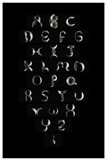
Light Bulb Alphabet
B&W Photos
I am getting started with a Canon Rebel XTi. I don't have much photography experience, but here are some of my first stabs at some Black and White photography. I love the stop motion and long exposure photographs; there is something fascinating and super-natural about them.
Tuesday, July 17, 2012
For Sale
By the way, I should mention that the prints I have listed are for sale. I have limited quantities of each, but I will take offers here first before I sell them on Etsy. So if your interested in anything, let me know ASAP
"Infinity Flower"
I stumbled across this idea while working on a different project (which I will hopefully get posted soon) where I was overlaying type in CMYK. The concept was that the core elements of letters have stayed the same throughout time, but the styles, the serifs, the accents, strokes, etc. are what have changed. By overlaying type from different periods in time and from different classifications, the outside edges would be various colors, but the core would multiply to a rich black.
I wanted to perform this concept using infinity signs on a much larger more complex way, but time/resources/difficulty constrained me to this print. I will return to this concept to really flesh it out.
"Breaking Free"
As a growing designer, I find myself stuck in boxes all the time. I limit myself and impose myself without hardly even realizing it. As I was printmaking, I was reminded of this by the impression that the plates made in the paper during printing. I wanted to have an expression of breaking out. I find that when I ask myself questions, "why not try this?" "what if that happened?" and especially when I find myself think, "no, I can't do that, it won't work." To quickly rebuttal with, "Why not?" When I do that, I find that my designs become more interesting and creative. Thus this piece is about breaking free with questions.
"Form of Beauty"
This was my fist composite print that I completed. I based the image on different elements that I find beautiful. The background is a rough rendition of a photo that I took in the City of Rocks near my home. I am also always impressed by the presence of the golden mean in the world. It will show up in nature, in type, in so many good designs; it is prevalent and powerful. The overall scope of this piece was to communicate some of my life and what I find beautiful.
Subscribe to:
Posts (Atom)


